Do Mindfully
A Calmer Approach to Getting Things Done
A mindful task-management ecosystem designed to help students and professionals organize academic, career, and personal responsibilities without the anxiety and cognitive overload of traditional productivity tools.
Role: Lead Product Designer · UX Researcher
Core Focus: UX Research · Information Architecture · Interaction Design · Calming Visual Systems
Tools: Figma · Adobe Illustrator · Adobe Photoshop
Timeline: 2024 (Concept Prototype)

Context & Strategic Challenge
Managing overlapping academic, professional, and personal timelines can quickly become mentally exhausting. Ironically, most existing productivity tools amplify this stress by deploying dense, rigid interfaces, aggressive push notifications, and overwhelming dashboards that prioritize sheer output volume over mental well-being.
The Mission: How might we synthesize a supportive, low-pressure task-management workspace that reduces cognitive load and protects user well-being?
The Solution: Do Mindfully brings disparate areas of a user's life into one cohesive space, relying on minimalist layouts and gentle reinforcement patterns to make planning feel therapeutic rather than demanding.

The Double Diamond UX Process
To guide the concept from abstract frustration into an organized ecosystem, I deployed the industry-standard Double Diamond framework, structuring my execution across four distinct stages:
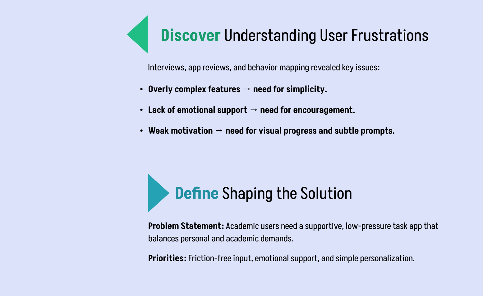
Discover: Conducted deep-dive user interviews, analyzed existing market application reviews, and mapped out user behaviors to pinpoint exact emotional and technical pain points.
Define: Synthesized research findings into clear user personas, mapped user journeys, and isolated high-priority features that directly reduce mental strain.
Develop: Explored structural possibilities through quick ideation sketching, interaction mapping, and iterative wireframing in Figma.
Deliver: Brought the ecosystem to life via high-fidelity interface layouts, a soothing visual design language, and supportive feedback loops.

Research Insights & Core Needs
My qualitative research and user mapping uncovered three primary friction points, which I translated into core pillars for the product architecture:
Radical Simplicity: Users explicitly demanded the removal of complex sub-menus, aiming to make task inputs completely effortless.
Emotional Support: The platform needed to provide encouragement and track accomplishments without generating artificial urgency or pressure.
Subtle Motivation: Progress markers needed to be integrated seamlessly into the layout via soft, organic visual cues rather than harsh compliance checkmarks.

Target Audience & Persona Framing
The target ecosystem centers on individuals aged 20–40, focusing heavily on higher-education students, international students, and university faculty balancing complex, high-pressure research, work, and life milestones.
User Personas: I structured deep persona models to represent the varied organizational habits, priorities, and emotional stressors unique to this academic and career cross-section.
The Customer Journey: Mapped the emotional highs and lows of an individual’s typical weekly workflow to locate precisely when a traditional tool causes anxiety versus when a supportive interface could offer relief.

Information Architecture & Core Product Features
Using the structural wireframes developed during the sketching loops, I engineered a highly intentional, low-friction feature roadmap:
Personal & Shared Environments: Distinct, isolated tabs that separate individual self-care or personal tasks from team-based or collaborative academic responsibilities to prevent mental blurring.
Integrated Context Spaces: Kept contextual notes, resource links, and documents nested safely inside individual tasks to eliminate app-switching friction.
Gentle Notification Systems: Reminders use softer tone language and mindful placement rather than intrusive badges to keep users aware without inducing guilt.
Fluid Schedule Integration: Merged task backlogs into a simplified calendar view to provide a clear, calm understanding of upcoming deadlines.

High-Fidelity UI & Calming Visual System
The finalized design language intentionally strips away visual noise, utilizing soft organic colors, spacious grid alignments, and smooth transitions to lower the user's heart rate.
Decompressed Grid Architecture: Expanded padding and white space to give elements breathing room, preventing the cluttered feeling common in traditional tools.
Mindful Visual Cues: Progress is tracked using soft gradients and fluid graphics that shift subtly as milestones are hit, celebrating completion gracefully.

Strategic Retrospective
Product design is not exclusively about velocity or optimizing an interface to help users do more; it is about protecting the user's focus and peace of mind while they do what matters.
The Main Takeaway: Do Mindfully matured my capabilities in emotional design, proving that next-generation productivity shouldn't focus on pushing humans to work faster—it should focus on creating accessible environments that help them manage their responsibilities with clarity and less stress.


