Re-Wear
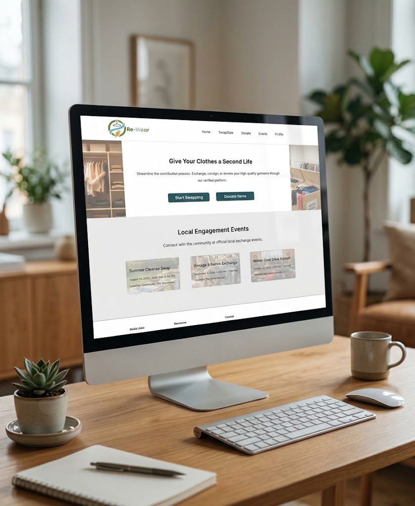
Give Clothes a Second Life
A sustainable product concept designed to make clothing donation and swapping more accessible while encouraging more responsible consumption.
Role: Lead Product Designer & UX Researcher
Core Focus: Product Strategy · End-to-End UX/UI · A/B Testing & Data Validation
Tools: Figma · Miro · Notion
Timeline: 5-Week-2025

Context & Strategic Challenge
Fast fashion, micro-trends, overproduction, and the convenience of e-commerce have made clothing easier to acquire and easier to discard. Meanwhile, traditional donation and secondhand options introduce heavy friction, from time-consuming drop-off logistics to disorganized shopping experiences.
The Mission: How might we make it easier for people to keep clothing in circulation by creating a seamless path to donate, swap, and discover?
My Execution: As the solo product designer and UX researcher, I led the entire lifecycle—from conducting user interviews and problem framing through exploratory sketching, UX architecture, usability testing, data analysis, and high-fidelity interface design.
The Ultimate Goal: Eliminate the friction of sustainability. Create an effortless alternative to discarding clothes by building a unified pathway to give, exchange, and reuse garments.

Discovery & User Research
I conducted six structured user interviews to understand how people handle unwanted clothing and uncover the precise barriers preventing them from utilizing circular textile networks.
The research synthesized insights across two primary target user groups:
Conscious Consumers: Individuals highly motivated to reduce personal waste and ensure their clothing finds a meaningful second life.
Urban Users: City dwellers needing quick, frictionless access to local shelters, donation centers, and community exchange hubs.
The Core Insight: The design challenge shifted from a generic "clothing donation" concept to building an accessible, high-trust system for keeping materials continuously in motion.


UX Architecture & Ideation
To explore structural solutions before committing to high-fidelity pixels, I initiated rapid sketching exercises and behavioral mapping.
Exploratory Sketching: Mapped multiple interaction patterns across donation logs, peer-to-peer swapping feeds, item listing steps, and account dashboards to establish a clear hierarchy.
Low-Fidelity Blueprinting: Translated the strongest concepts into low-fidelity wireframes in Figma, intentionally stripping away visual styling to focus strictly on navigational flow, task sequence, and usability.

Usability Testing & Iteration Loops
I ran usability testing sessions to evaluate whether users could complete primary tasks—such as listing an item or locating a donation partner—with minimal cognitive load.
The testing revealed two critical design opportunities:
Navigation Discoverability: Users struggled to locate personal settings, signaling that account controls required higher layout visibility.
Visual Wayfinding: Navigating text-heavy feeds without imagery caused friction, highlighting a strong need for contextual visual cues.
The Iteration: I directly leveraged these behavioral insights to restructure the global navigation bar and information cards before moving into high-fidelity production.

A/B Testing & Data Validation
To determine the final visual direction, I designed the product in both Light Mode and Dark Mode, executing a comparative analysis framework to balance user preference with actual behavioral performance.
The Methodology: Evaluated both modes using Single Ease Question (SEQ) scores and task completion metrics.
Preference Evaluation: Analyzed qualitative participant feedback to understand visual comfort, brand trust, and emotional alignment.
Performance Evaluation: Measured behavioral evidence to see which interface mode optimized reading speed and minimized user error during multi-step tasks.


High-Fidelity UI & Scalable Design System
The finalized interface synthesizes donation logistics, peer-to-peer exchange, and open discovery into a beautiful, unified digital ecosystem.
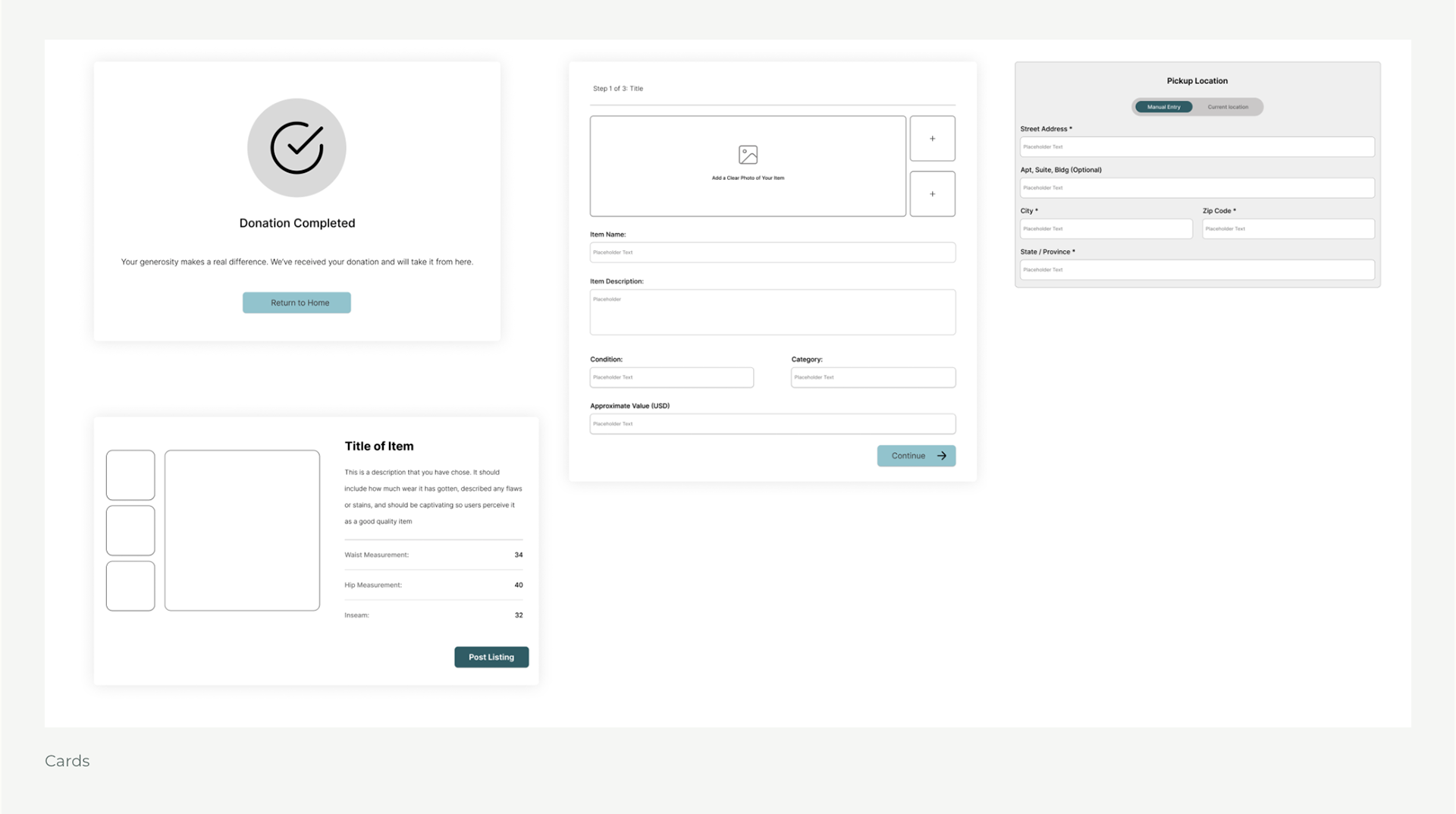
Donation Interface: A streamlined, guided pathway that minimizes the steps required to move clothing to verified local organizations.
Swap System: An intuitive peer-to-peer alternative to traditional retail, optimized for quick communication and transparent item condition ratings.
Discovery Feeds: Rich visual browsing cards with strong typographic hierarchy to ensure items and destinations are clear at a glance.
Atomic Design System: Engineered a comprehensive, reusable component library—covering typography scales, color tokens, button states, flexible cards, and custom iconography—ensuring perfect visual consistency across both display modes.


Project Reflection & Strategic Retrospective
Sustainable intention only becomes meaningful when the path to act on it is simple and accessible. Re-Wear significantly matured my research-driven design capabilities, proving the importance of connecting raw usability metrics to micro-interactions.
The Core Lesson: Good product design doesn’t just present better, more sustainable choices to a user—it makes them effortless to act on.


